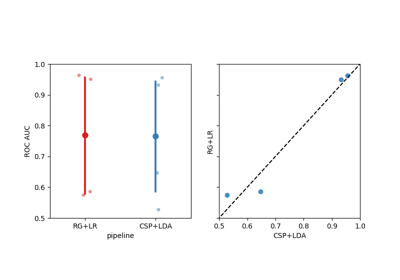
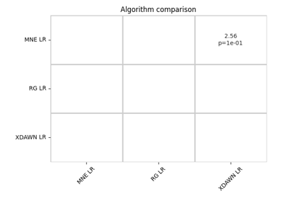
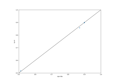
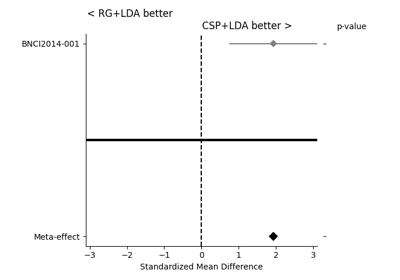
moabb.analysis.plotting.paired_plot#
- moabb.analysis.plotting.paired_plot(data, alg1, alg2, chance_level=None)[source]#
Generate a figure with a paired plot.
- Parameters:
data (
pandas.DataFrame) – Dataframe obtained from evaluation.alg1 (str) – Name of a member of column
data.pipeline.alg2 (str) – Name of a member of column
data.pipeline.chance_level (None, float, or dict) –
Chance level used to set axis limits and draw reference lines. Defaults to
None.None: defaults to 0.5.float: uniform chance level.dict: per-dataset levels (the minimum value across datasets is used for axis limits). When adjusted significance thresholds are included, a shaded band marks the “not significantly above chance” region.
- Returns:
fig – Pyplot handle.
- Return type: