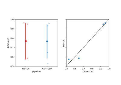
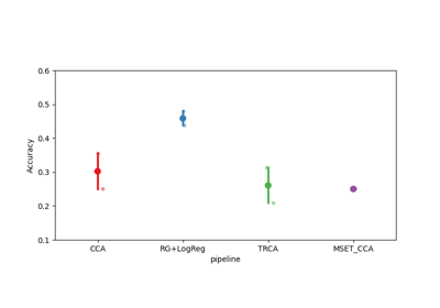
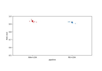
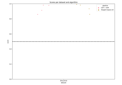
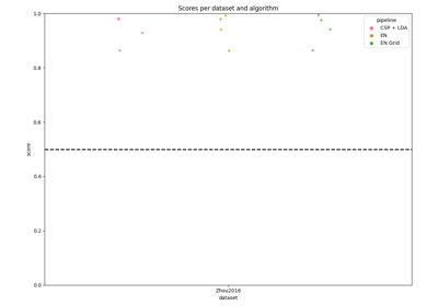
moabb.analysis.plotting.score_plot#
- moabb.analysis.plotting.score_plot(data, pipelines=None, orientation='vertical', chance_level=None)[source]#
Plot scores for all pipelines and all datasets.
- Parameters:
data (
pandas.DataFrame) – Output ofResults.to_dataframe().pipelines (list of str | None) – Pipelines to include in this plot.
orientation (str) – Plot orientation, one of
["vertical", "v", "horizontal", "h"]. Defaults to"vertical".chance_level (None, float, or dict) –
Chance level to display on the plot. Defaults to
None.None: defaults to 0.5 for all datasets (backward compatible).float: uniform chance level for all datasets.dict: per-dataset chance levels. Can be a simple{dataset_name: float}mapping or the output ofchance_by_chance. When the dict includes'adjusted'entries, adjusted significance threshold lines are also drawn.
- Returns:
fig (
matplotlib.figure.Figure) – Pyplot handle.color_dict (dict) – Dictionary with the facecolor for each pipeline.