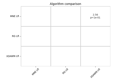
moabb.analysis.plotting.summary_plot#
- moabb.analysis.plotting.summary_plot(sig_df, effect_df, p_threshold=0.05, simplify=True)[source]#
Significance matrix to compare pipelines.
Visualize significances as a heatmap with green/grey/red for significantly higher/significantly lower.
- Parameters:
sig_df (
pandas.DataFrame) – DataFrame of pipeline x pipeline where each value is a p-value,effect_df (
pandas.DataFrame) – DataFrame where each value is an effect size
- Returns:
fig – Pyplot handle
- Return type: