

Note
Go to the end to download the full example code.
Dataset bubble plot#
This tutorial shows how to use the moabb.analysis.plotting.dataset_bubble_plot()
function to visualize, at a glance, the number of subjects and sessions in each dataset
and the number of trials per session.
# Authors: Pierre Guetschel
#
# License: BSD (3-clause)

import matplotlib.pyplot as plt

from moabb.analysis.plotting import dataset_bubble_plot
from moabb.datasets import (
    BNCI2014_001,
    Cho2017,
    Hinss2021,
    Lee2019_ERP,
    Sosulski2019,
    Thielen2021,
    Wang2016,
)
from moabb.datasets.utils import plot_datasets_cluster, plot_datasets_grid
Visualizing one dataset#
The moabb.analysis.plotting.dataset_bubble_plot() is fairly simple to use.
It takes a moabb.datasets.base.BaseDataset as input and plots
its characteristics.
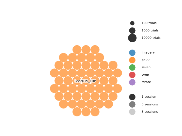
Each bubble represents one subject. The size of the bubble is proportional to the number of trials per subject on a log scale, the color represents the paradigm, and the alpha is proportional to the number of sessions.
You can adjust plotting parameters, such as the scale of the bubbles, but
we will leave the default values for this example.
More details on the parameters can be found in the doc (moabb.analysis.plotting.dataset_bubble_plot()).
Alternatively, ou can also plot hexagons instead of circles,
using the shape parameter.
dataset = Lee2019_ERP()
dataset_bubble_plot(dataset, shape="hexagon", gap=0.1)
plt.show()
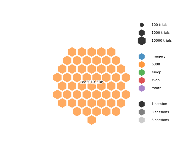
In this example, we can see that the moabb.datasets.Lee2019_ERP dataset
has many subjects (54), 2 sessions, and a fairly large number of trials per session.
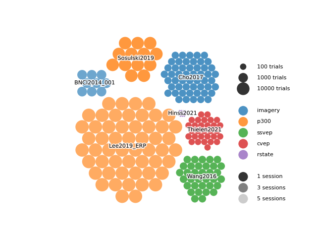
Visualizing multiple datasets simultaneously#
Multiple datasets can be visualized at once by using the ax and center parameters.
The ax parameter allows you to re-plot on the same axis, while the center parameter
allows you to specify the center of each dataset.
The following example shows how to plot multiple datasets on the same axis.
ax = plt.gca()
dataset_bubble_plot(Lee2019_ERP(), ax=ax, center=(10, 10), legend=False)
dataset_bubble_plot(BNCI2014_001(), ax=ax, center=(-2, 33), legend=False)
dataset_bubble_plot(Wang2016(), ax=ax, center=(37, -1), legend=True)
dataset_bubble_plot(Thielen2021(), ax=ax, center=(38, 16), legend=False)
dataset_bubble_plot(Hinss2021(), ax=ax, center=(30, 22), legend=False)
dataset_bubble_plot(Cho2017(), ax=ax, center=(33, 35), legend=False)
dataset_bubble_plot(Sosulski2019(), ax=ax, center=(13, 42), legend=False)
plt.show()
Another parameter available is size_mode. It allows you to choose how the size
of the bubbles is calculated. You can choose to use the number of trials per subject
(size_mode="count") or the duration of experiment data per subject
(size_mode="duration"). The experiment data duration is calculated
as the number of trials multiplied by the duration of each trial.
Here is the same plot as above, but using size_mode="duration":
ax = plt.gca()
kwargs = {"size_mode": "duration", "scale": 0.4, "ax": ax}
dataset_bubble_plot(Lee2019_ERP(), center=(10, 10), legend=False, **kwargs)
dataset_bubble_plot(BNCI2014_001(), center=(-2, 33), legend=False, **kwargs)
dataset_bubble_plot(Wang2016(), center=(35, -1), legend=True, **kwargs)
dataset_bubble_plot(Thielen2021(), center=(39, 16), legend=False, **kwargs)
dataset_bubble_plot(Hinss2021(), center=(27, 22), legend=False, **kwargs)
dataset_bubble_plot(Cho2017(), center=(33, 35), legend=False, **kwargs)
dataset_bubble_plot(Sosulski2019(), center=(13, 42), legend=False, **kwargs)
plt.show()
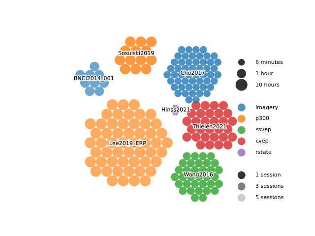
We can observe, for example, that the Thielen2021 contains few trials
per subject but very long trials (31,5 seconds) while Lee2019_ERP contains
many but short trials (1 second).
Visualizing a custom dataset#
You can also visualize your own dataset by manually specifying the following parameters:
dataset_name: name of the datasetn_subjects: number of subjectsn_sessions: number of sessionsn_trials: number of trials per sessionparadigm: paradigm nametrial_len: duration of one trial, in seconds
Here is an example of a custom dataset with 100 subjects, and 10000 trials per session:
dataset_bubble_plot(
    dataset_name="My custom dataset",
    n_subjects=100,
    n_sessions=1,
    n_trials=10000,
    paradigm="imagery",
    trial_len=5.0,
)
plt.show()
Visualizing all MOABB datasets#
Finally, you can visualize all datasets available in MOABB at once
by using the moabb.datasets.utils.plot_datasets_grid() function.
The datasets are sorted in alphabetical order and displayed on a grid.
When using this function, we recommend saving the figure as a PDF or SVG file, as the figure is quite large and may be long to render.
fig = plot_datasets_grid(n_col=5)
fig.tight_layout()
plt.show()
Alternatively, you can also use the moabb.datasets.utils.plot_datasets_cluster()
function to visualize the datasets in more compact format.
Total running time of the script: (0 minutes 5.375 seconds)
Run this example